

Scope of work:
Location:
Year:
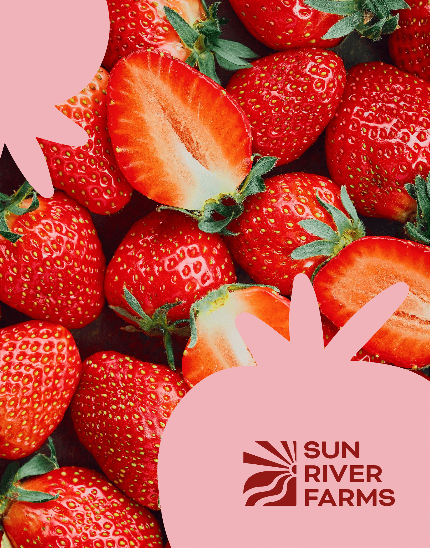
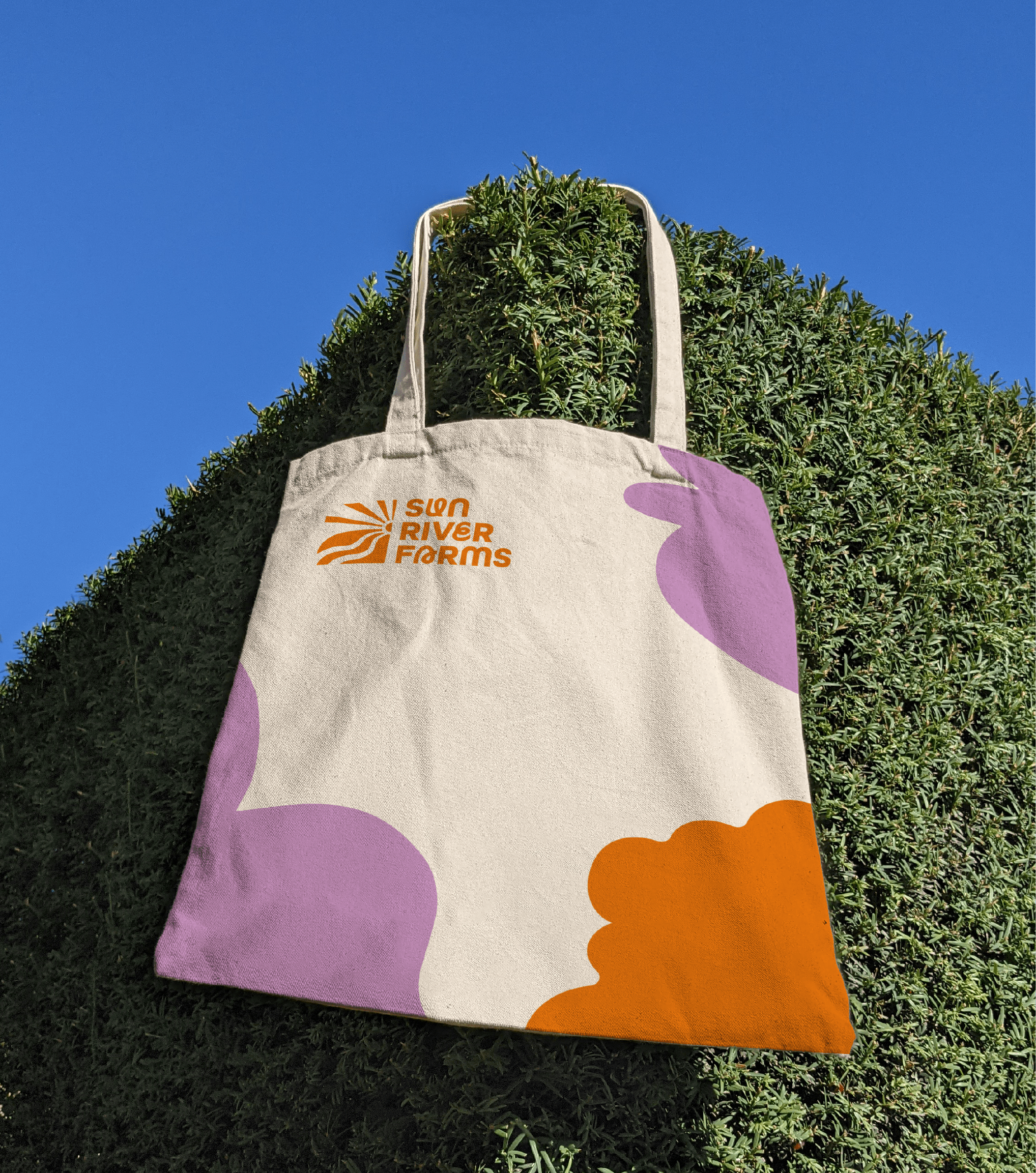
Rooted in a vision for freshness and distinction, we crafted organic shapes that seamlessly integrate into the isotype. The visual system draws inspiration from the natural forms of fruits and vegetables; abstracted to preserve their organic essence while reflecting the brand's identity.
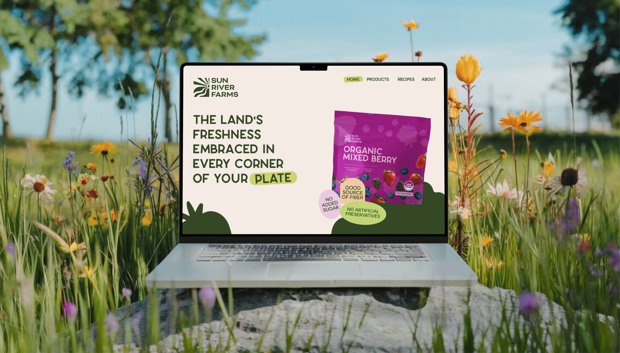
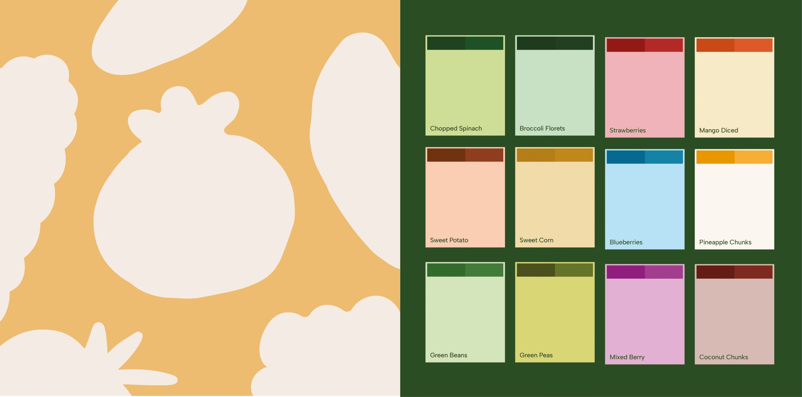
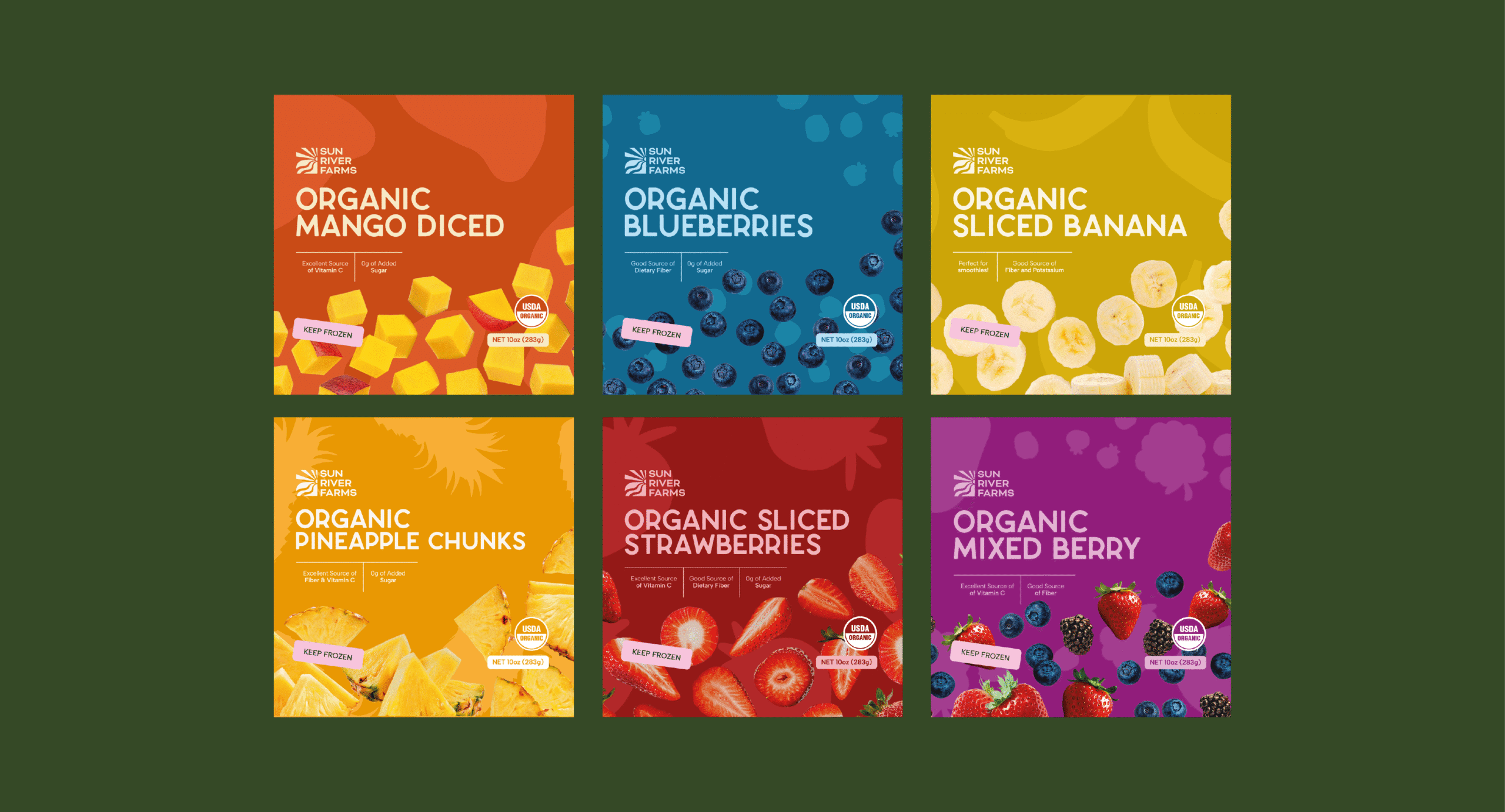
The color palette uses monochromatic tones to keep the focus on each product, allowing the produce to remain the hero. Large, dynamic imagery of fruits and vegetables placed at the bottom of the packaging adds movement and fluidity, creating a sense of energy and vitality.
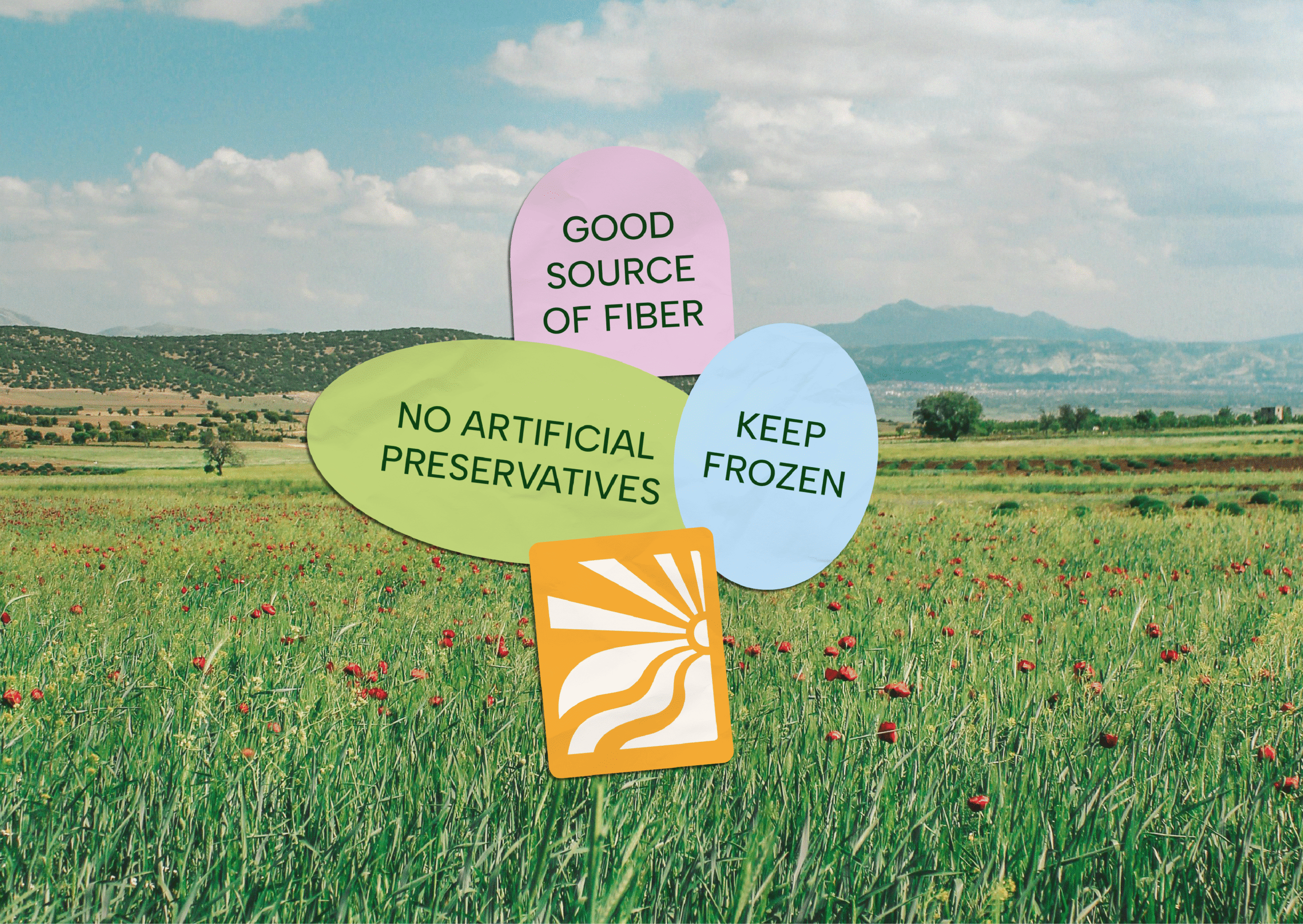
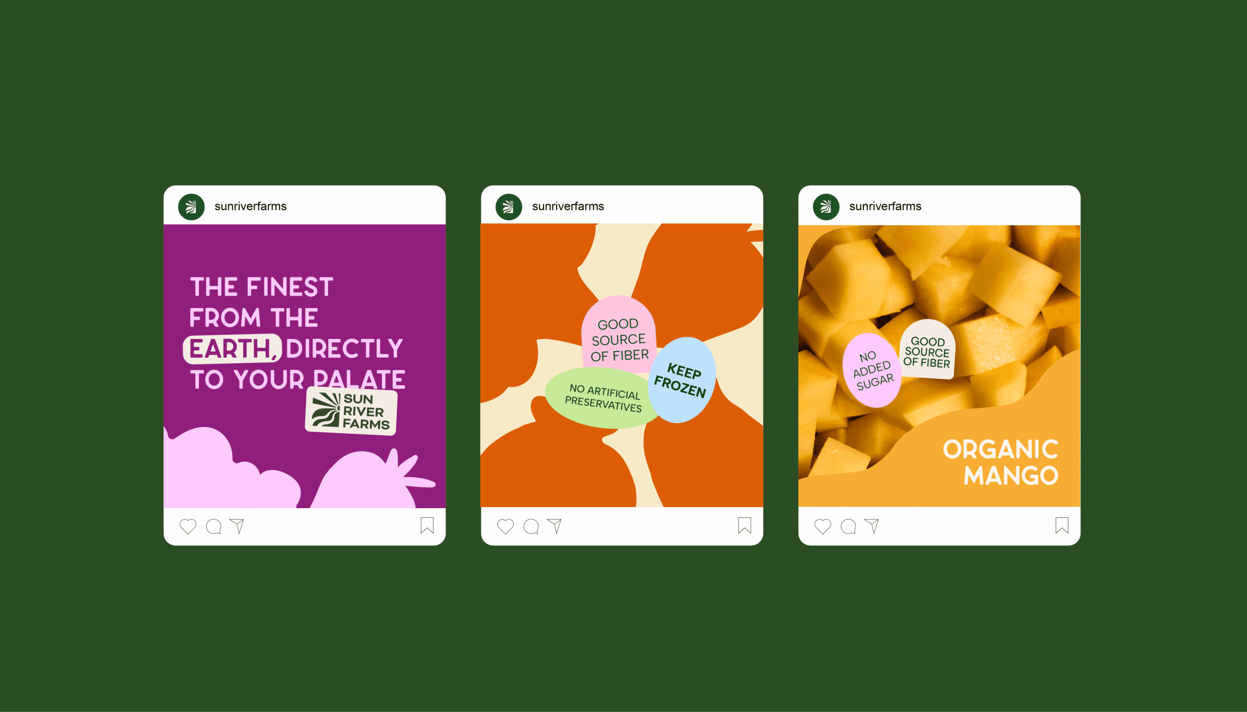
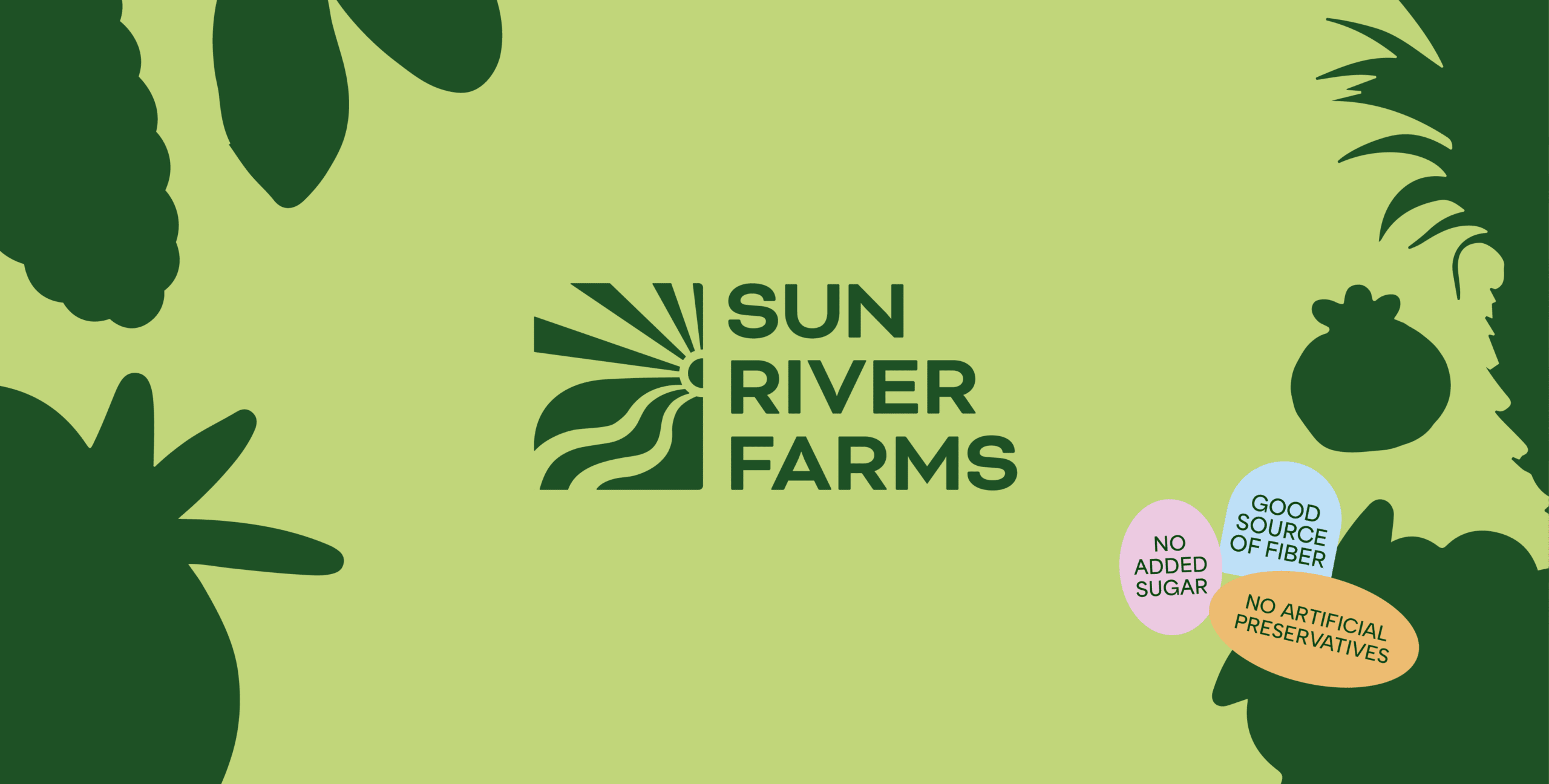
To highlight key benefits of frozen produce, stickers were introduced as an additional graphic layer. For typography, two contrasting sans-serif fonts were chosen , balancing thickness and form to ensure both readability and clarity across applications.
The result is a packaging system that feels clean, fresh, fluid, and unmistakably organic. It captures the essence of the brand while keeping the spotlight exactly where it belongs: on the produce itself.

