


Scope of work:
Location:
Year:
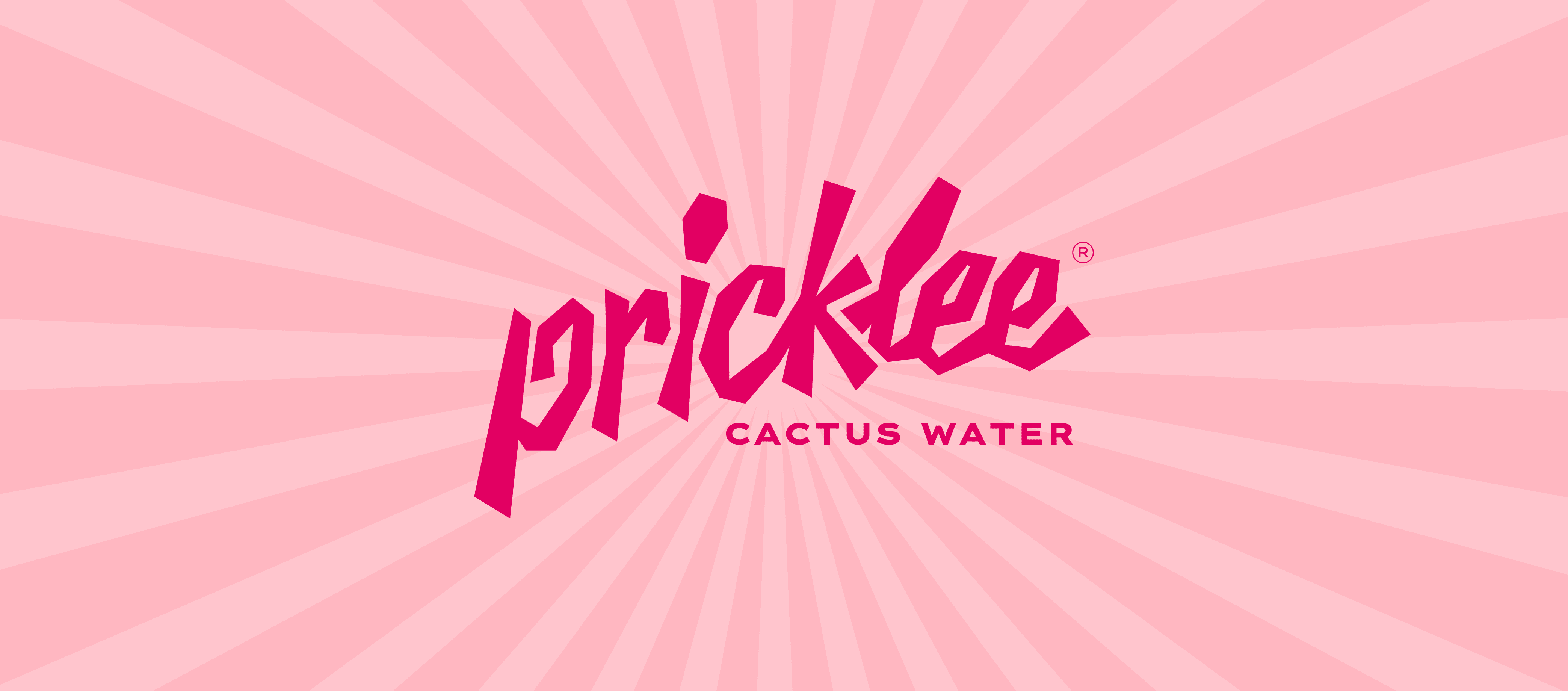
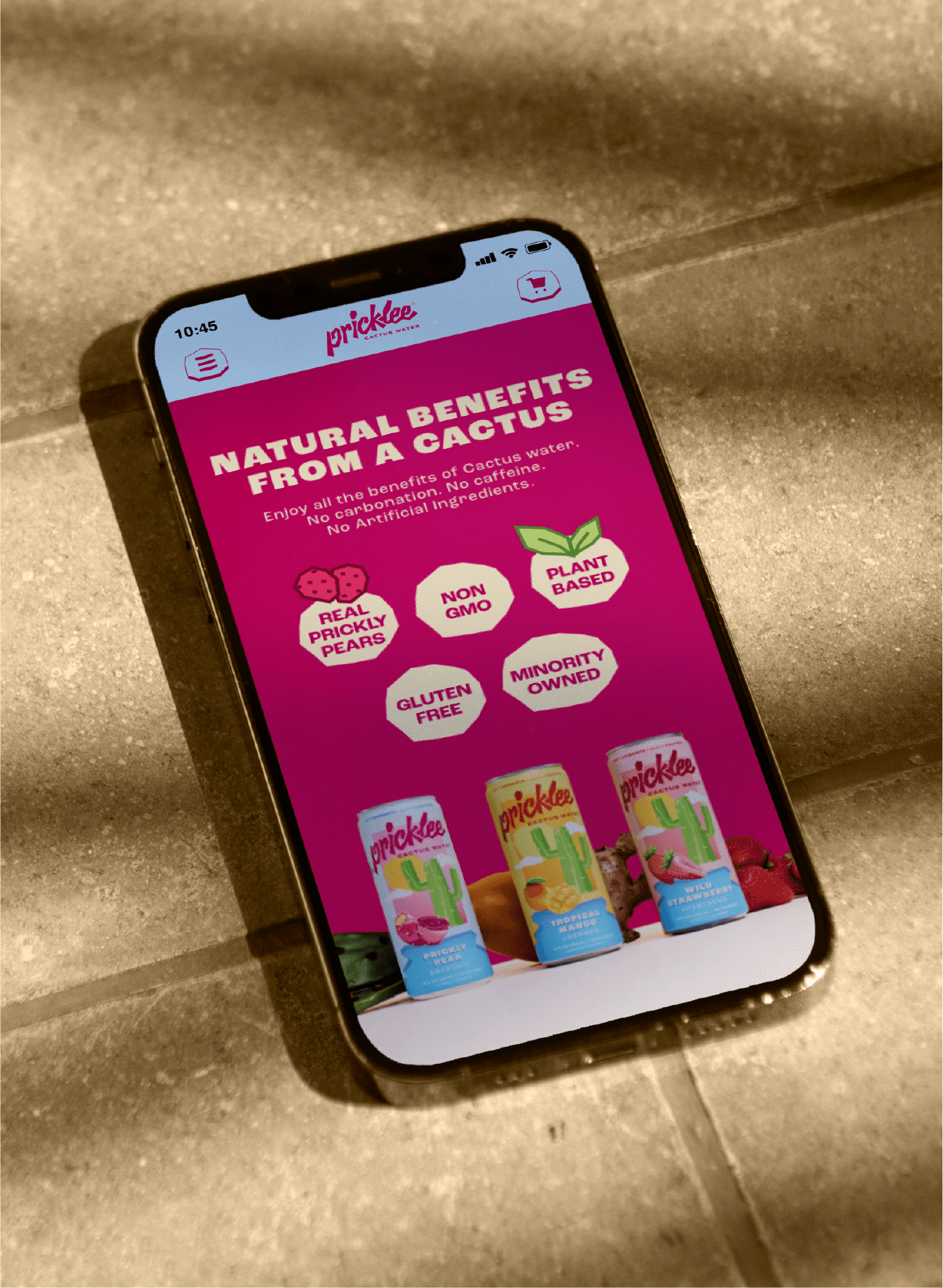
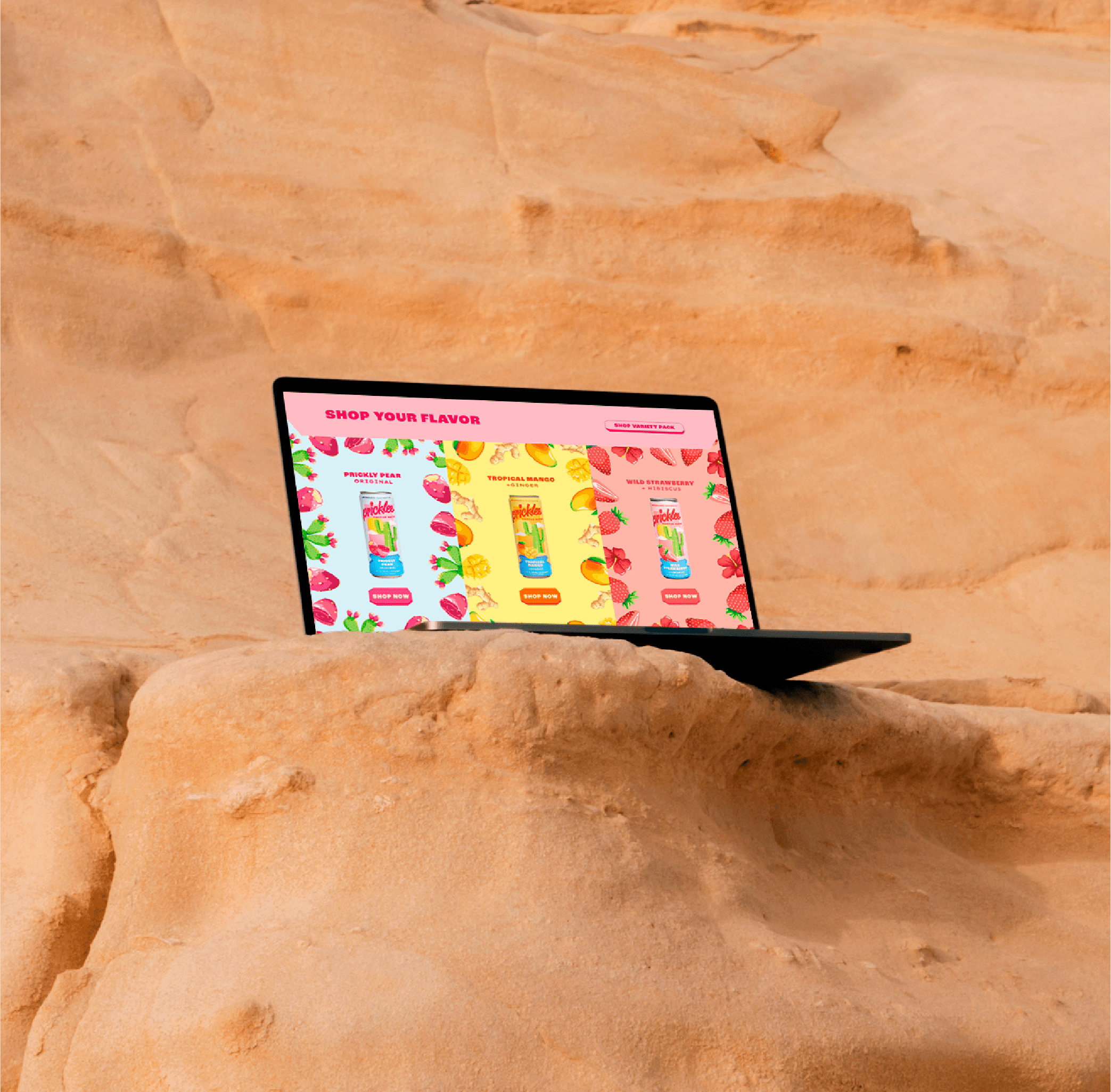
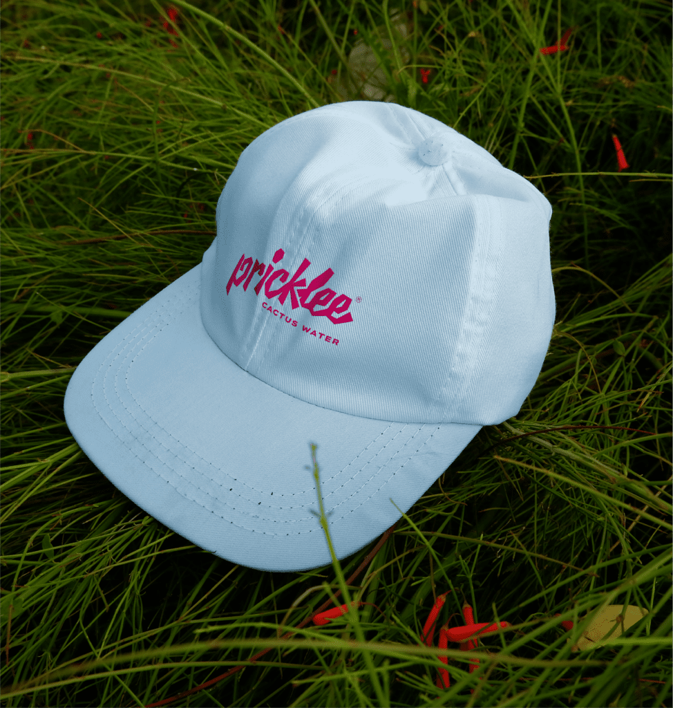
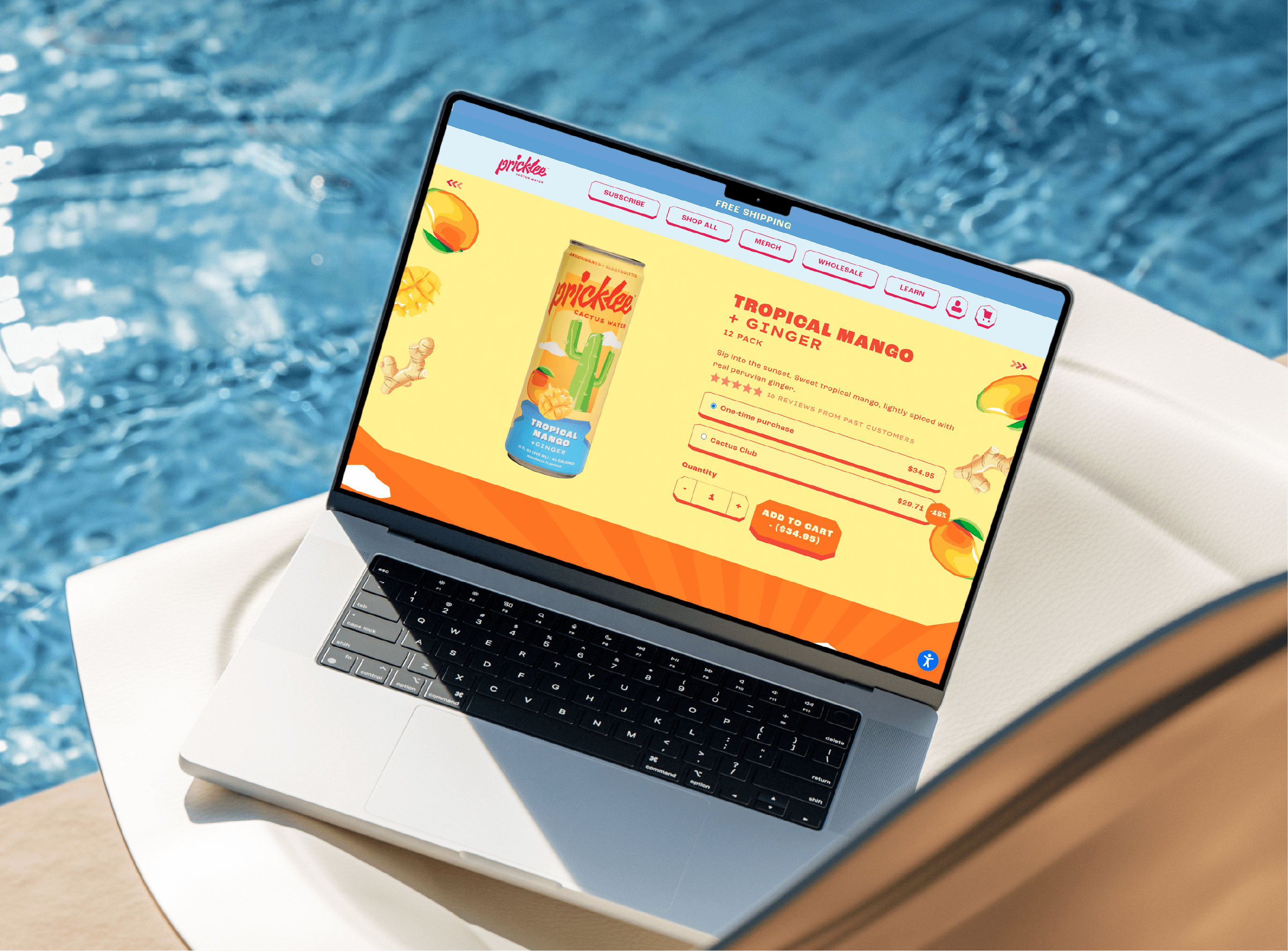
Pricklee came to us to reimagine their brand with a look that felt playful, fresh, and unmistakably bold. The goal was to build a brand identity for a wellness beverage that reflected their renewed mission: embodying resilience, just like the cactus itself. We responded by creating a youthful, vibrant visual world designed to stand out in the crowded functional drink and health beverage market.
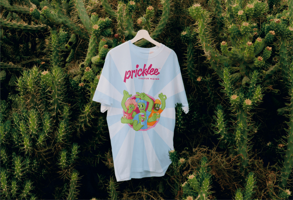
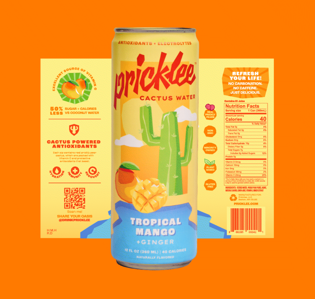
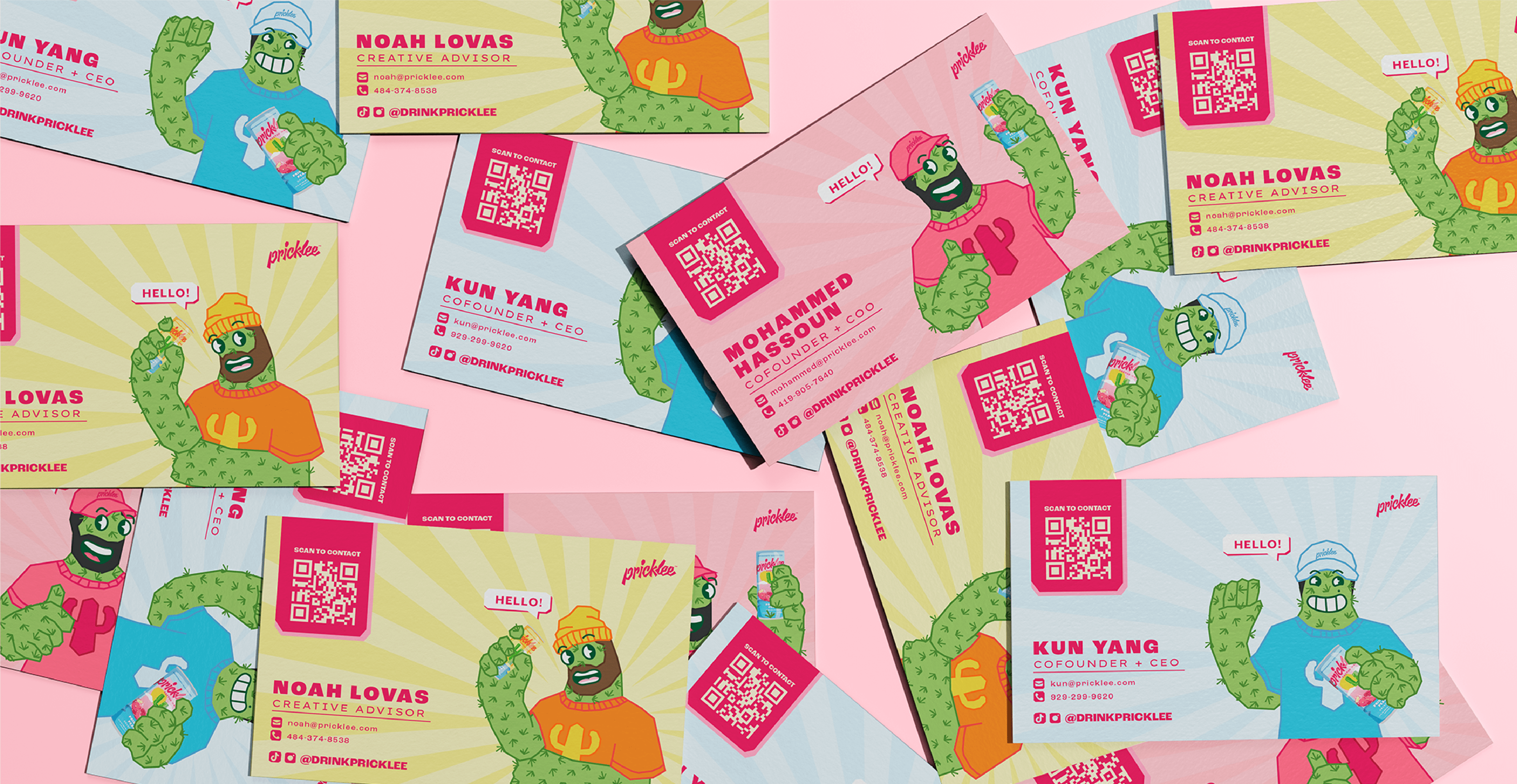
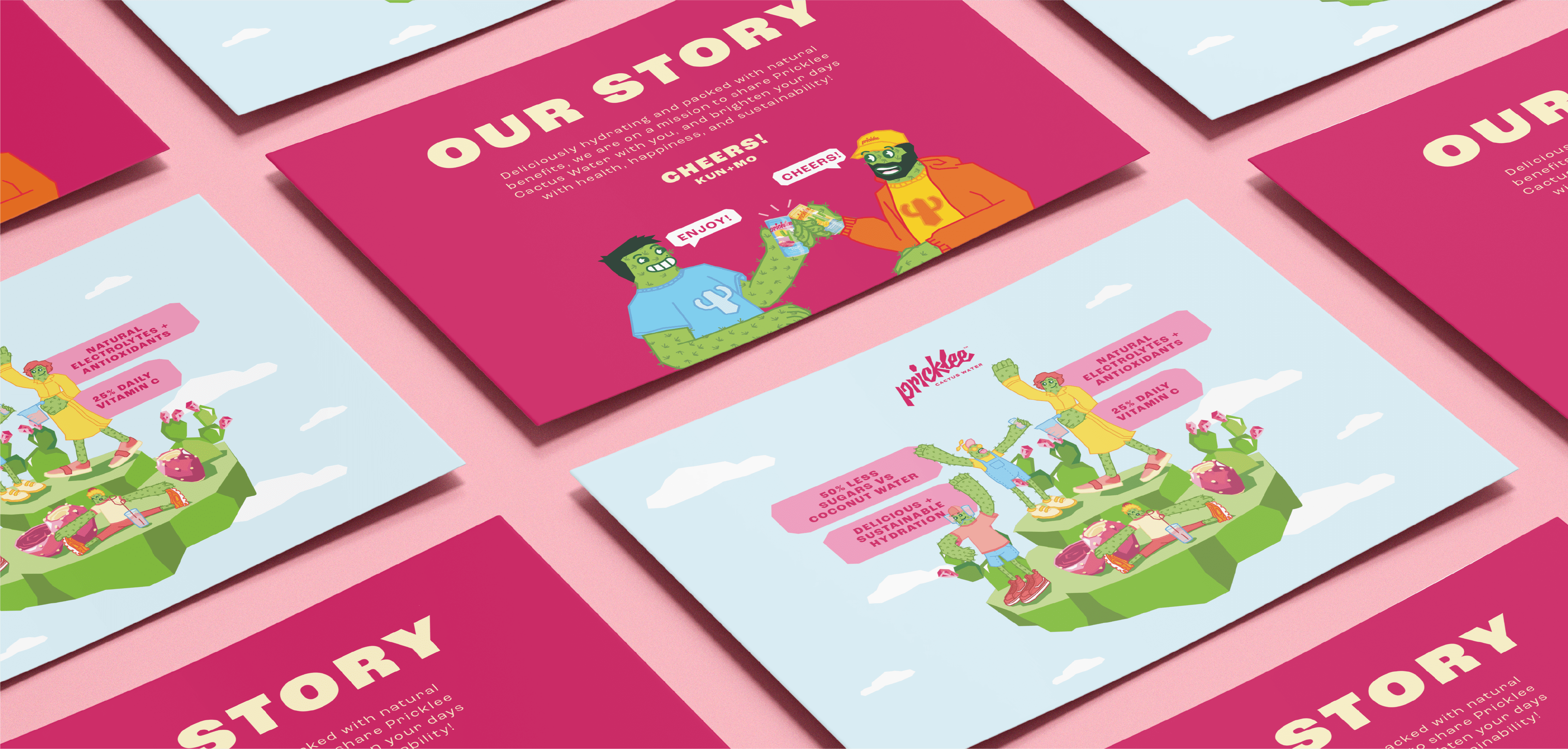
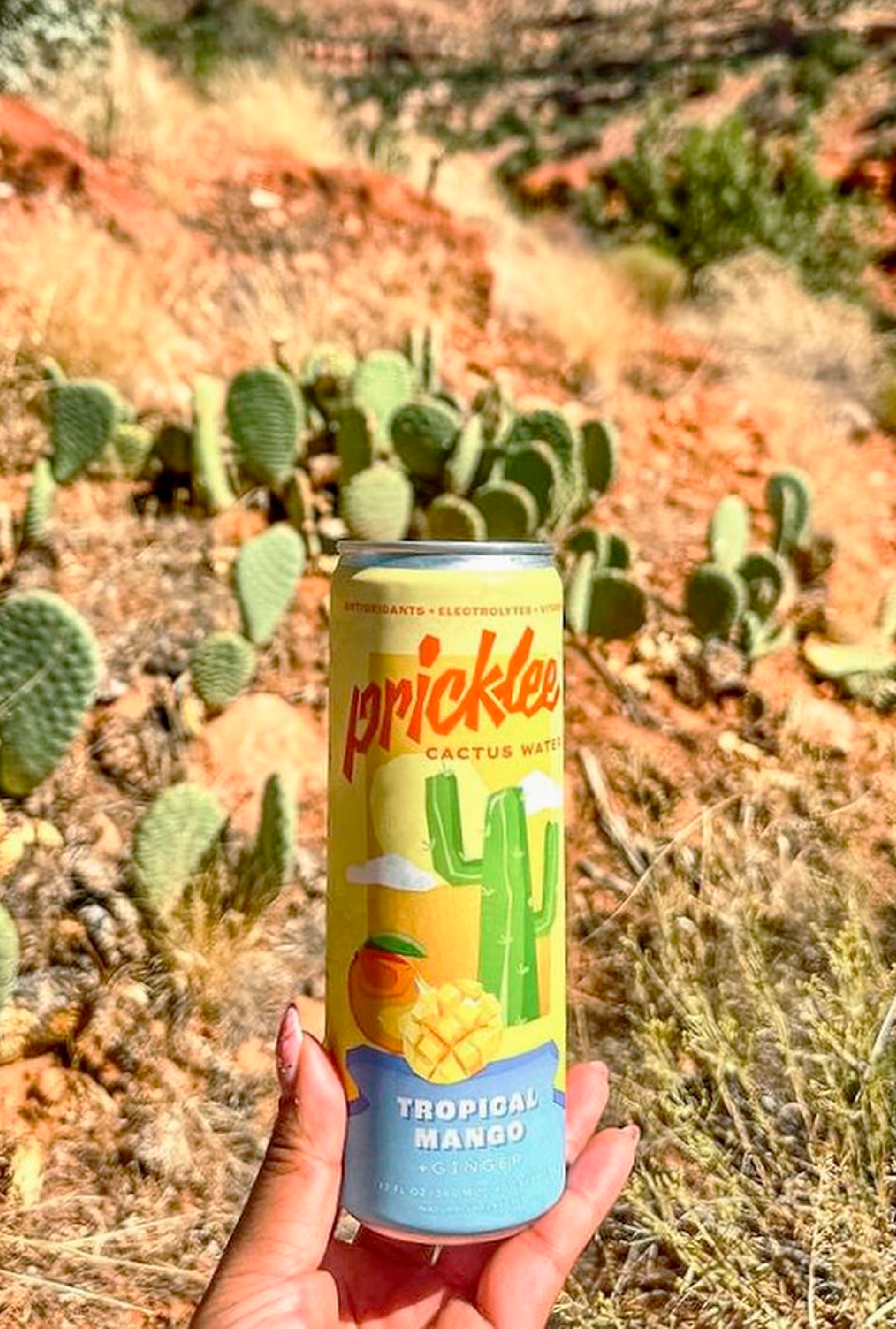
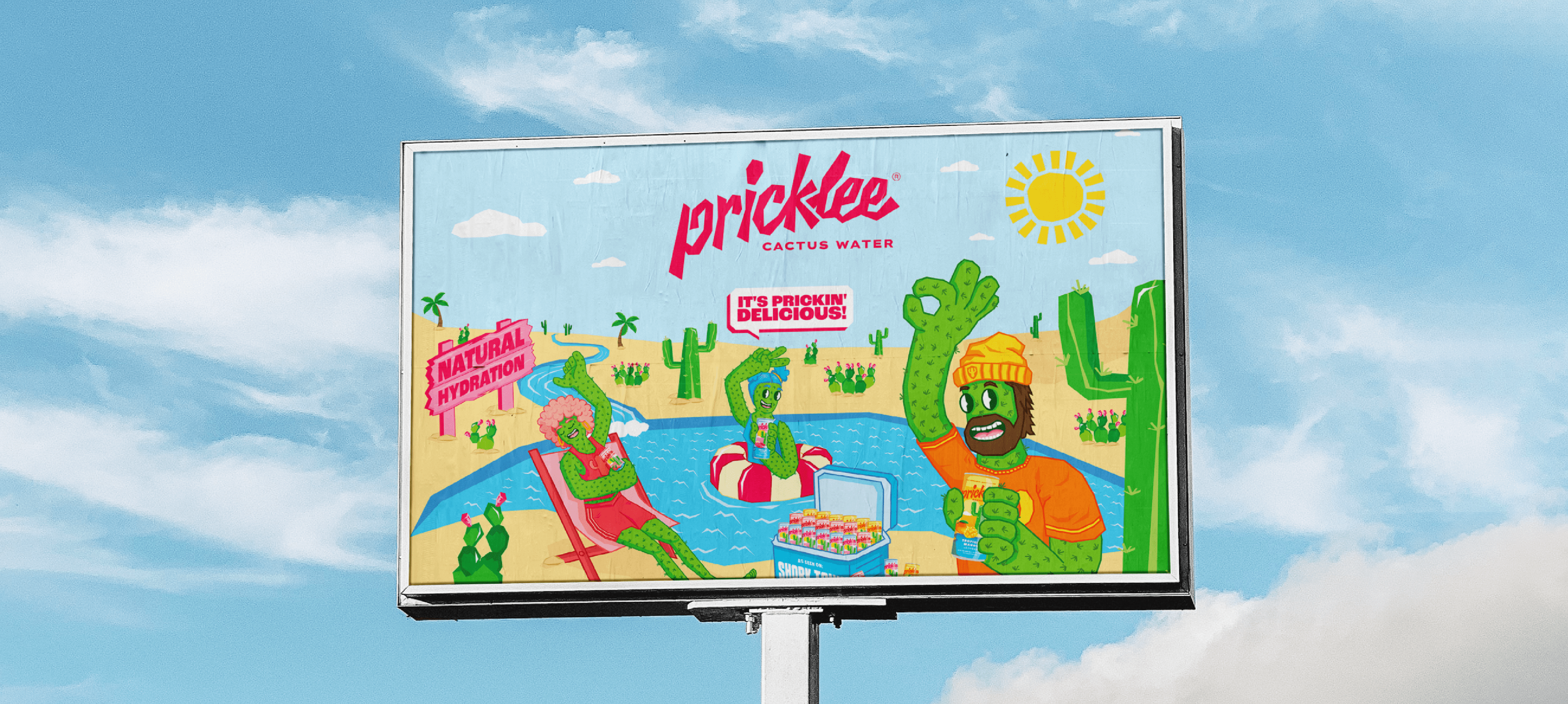
This concept became the foundation of the rebrand. We developed the Cactusverse—a lively, eclectic universe where cacti come to life. Both the logo and illustration style draw from the sharp, geometric forms of real cacti, symbolizing durability and strength while giving the brand a distinctive edge. These shapes anchor a system designed for strong beverage packaging design and shelf impact.
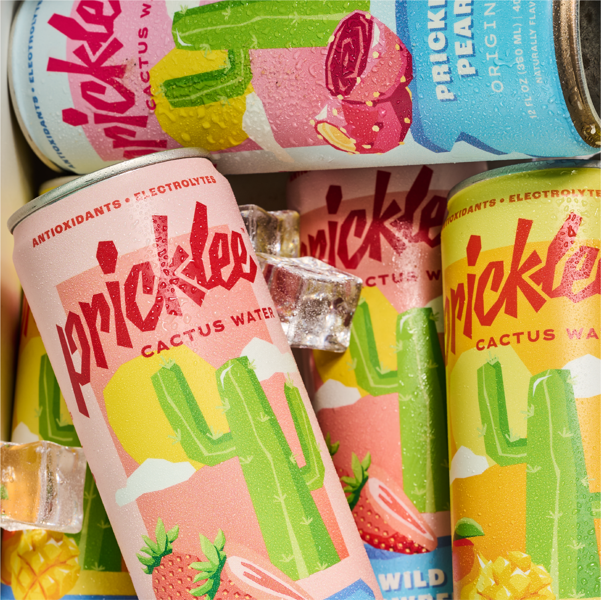
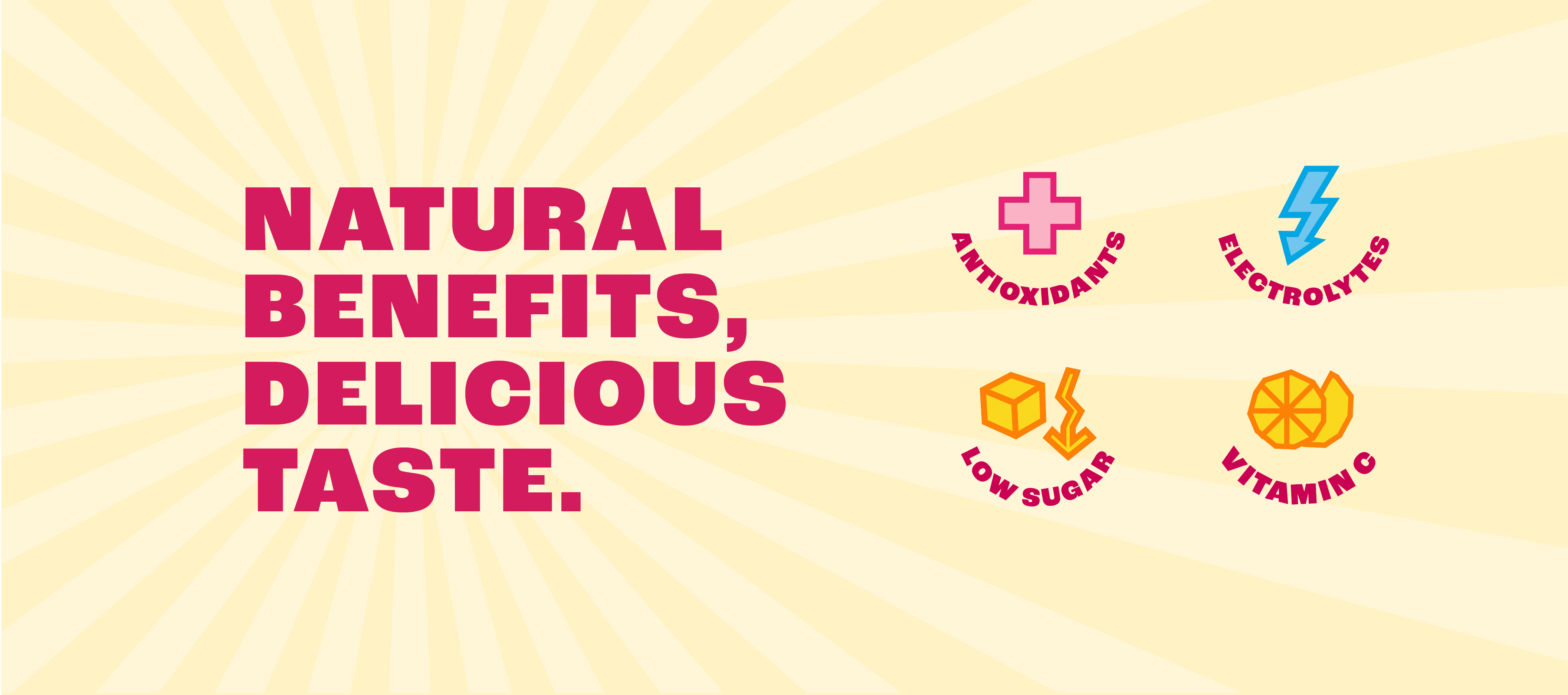
Within the Cactusverse, playful and energetic illustrations express movement, wellness, and sustainability. The characters and scenes reflect an active, optimistic lifestyle, aligning closely with Pricklee’s values and the benefits of cactus water as a modern hydration alternative.
The result is a bold, cohesive brand system built for wellness branding, functional beverage packaging, and consumer connection. Pricklee now lives in a joyful visual world where health feels fun, resilience feels empowering, and everyone belongs.