Sobelini

Services we did:

Branding, Copywriting, Packaging

Location:

United States.

Year:

2025
Sobelini is a premium chili oil crunch rooted in Italian culinary tradition and elevated with New York swagger. A vibrant blend of rich olive oil and fiery chili flakes, Sobelini is made to elevate pizza and much more. Designed to bring heat, texture, and serious swagger to the table, 
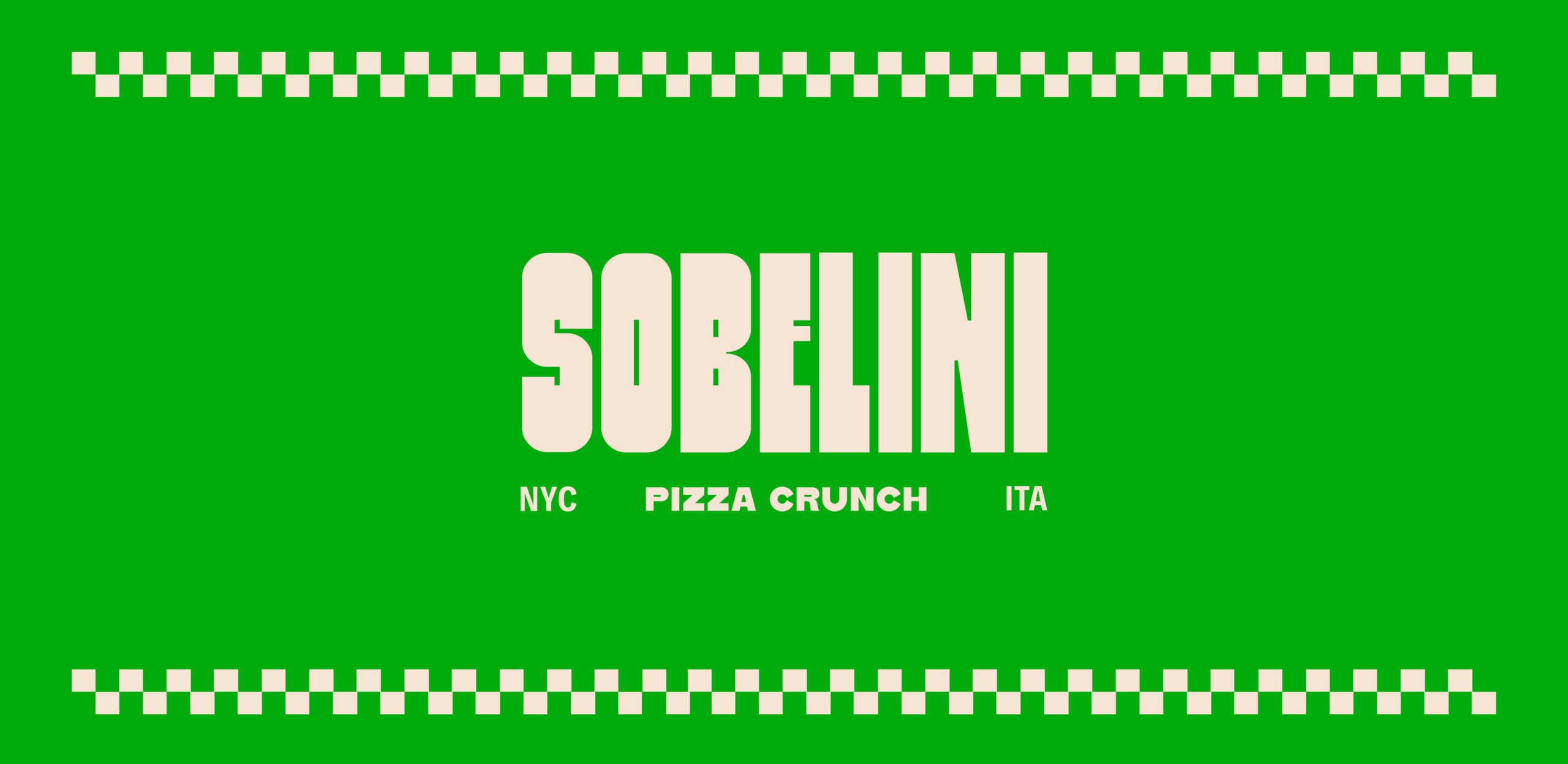
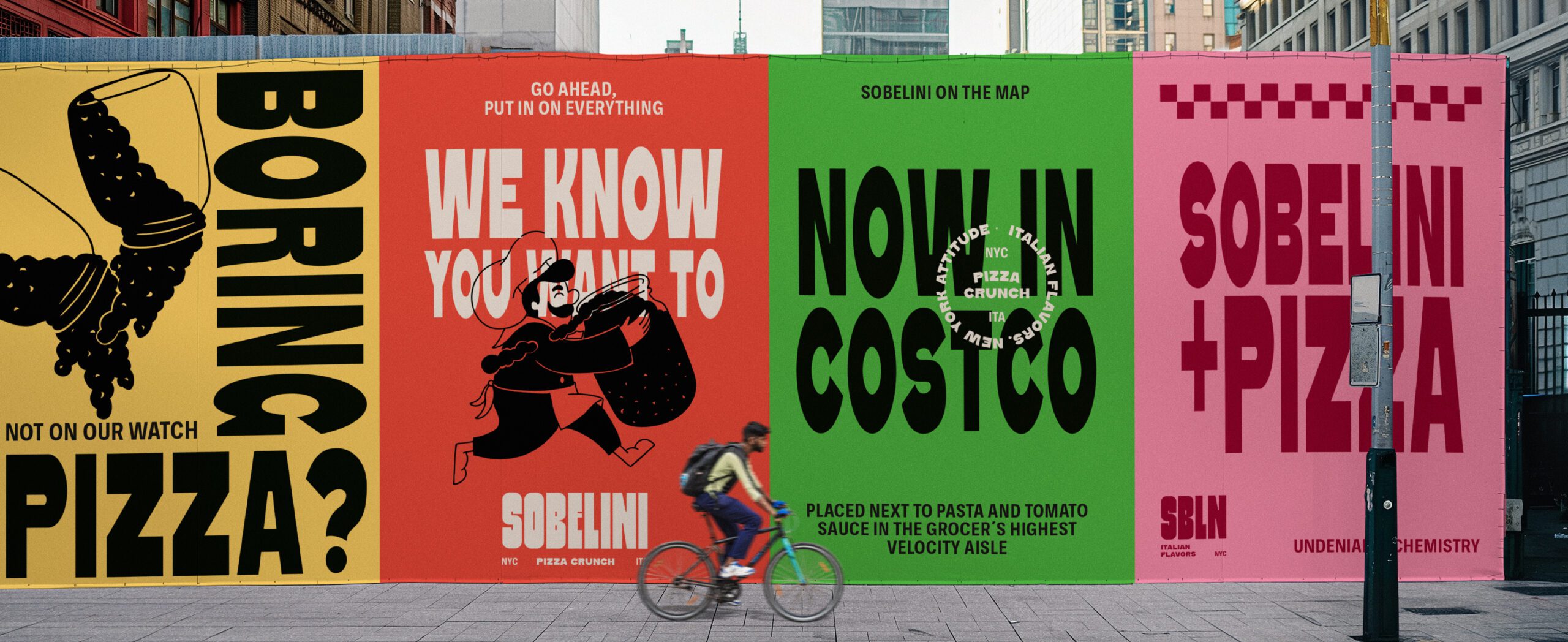
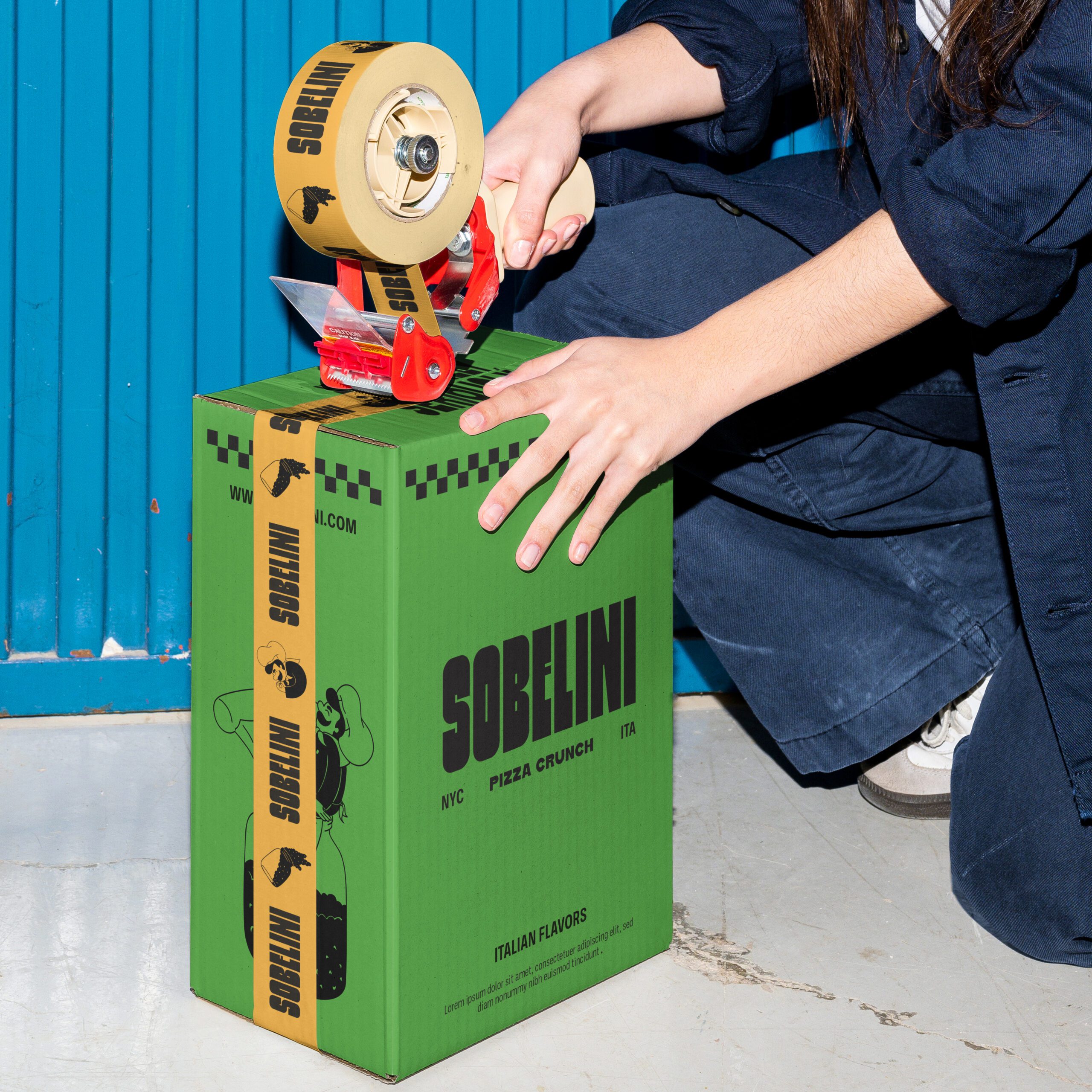
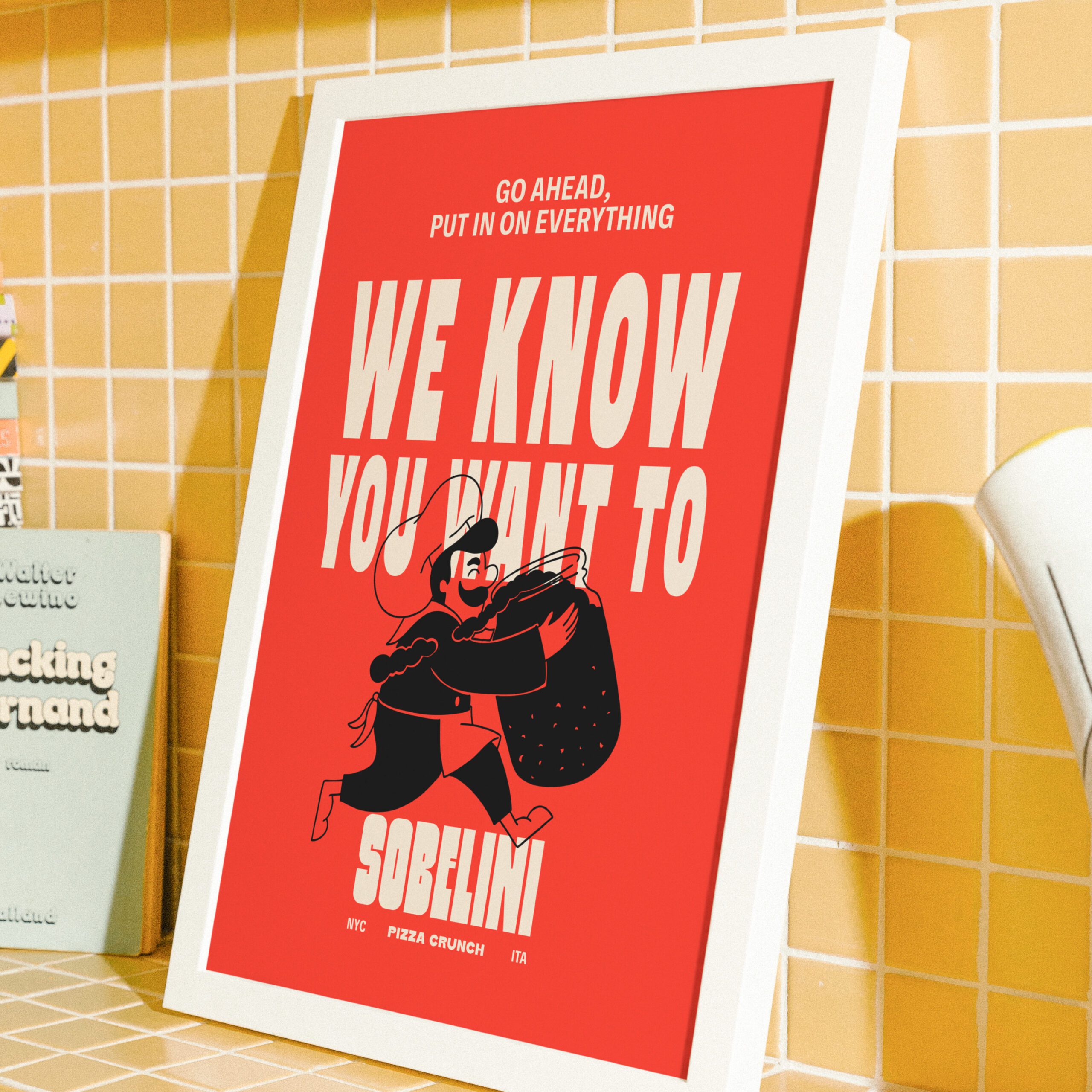
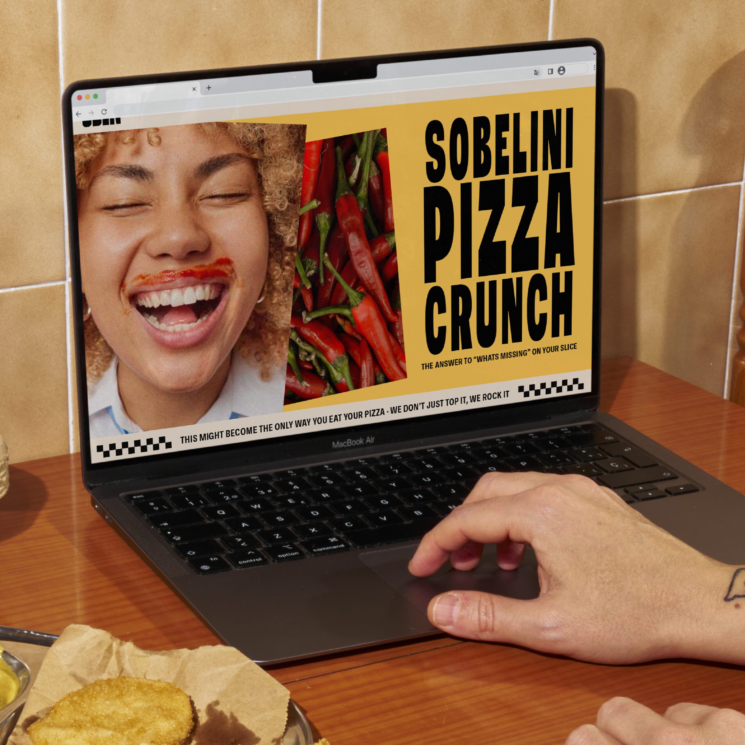
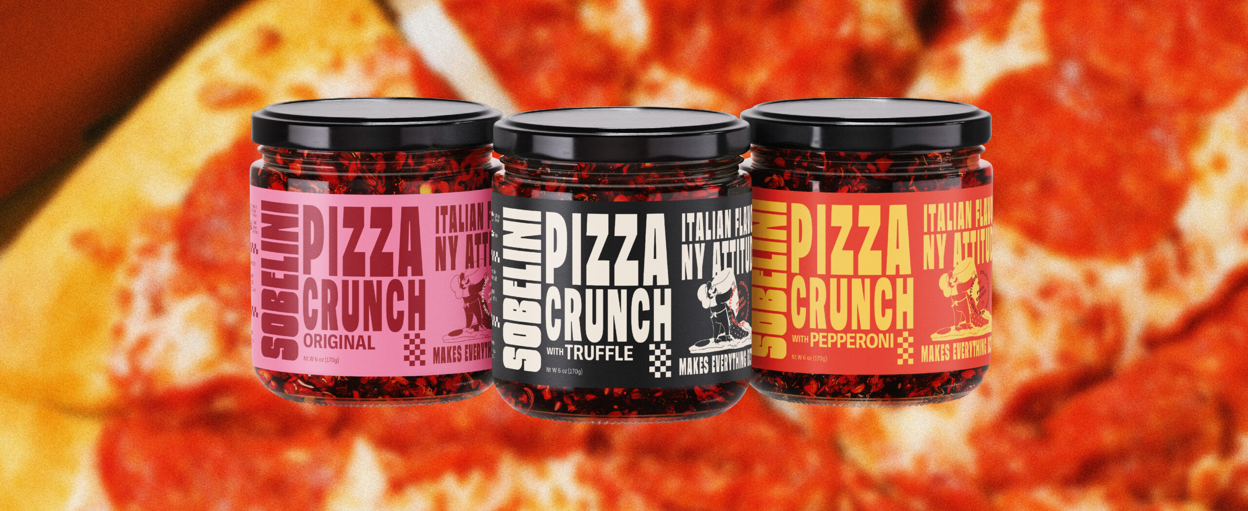
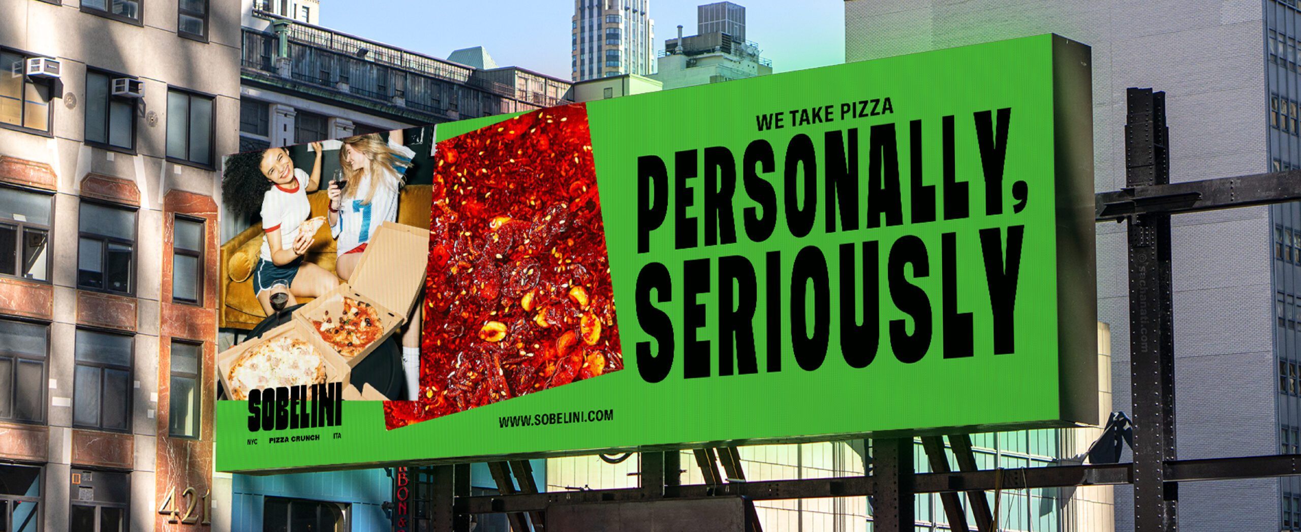
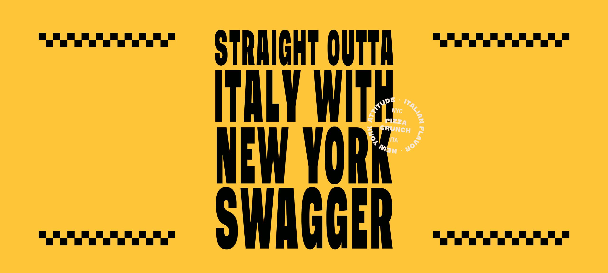
Sobelini asked us to build a brand that celebrates its Italian flavors while blending the bold energy of New York City.

To bring Sobelini’s fiery spirit to life, we created a visual identity that combines the richness of classic Italian flavor with the raw, magnetic energy of New York City. This brand isn’t about fine dining; t’s about bold, everyday flavor with big personality. Like grabbing a slice of pizza on a busy corner in NYC, Sobelini is loud, layered, and eye-catching. 
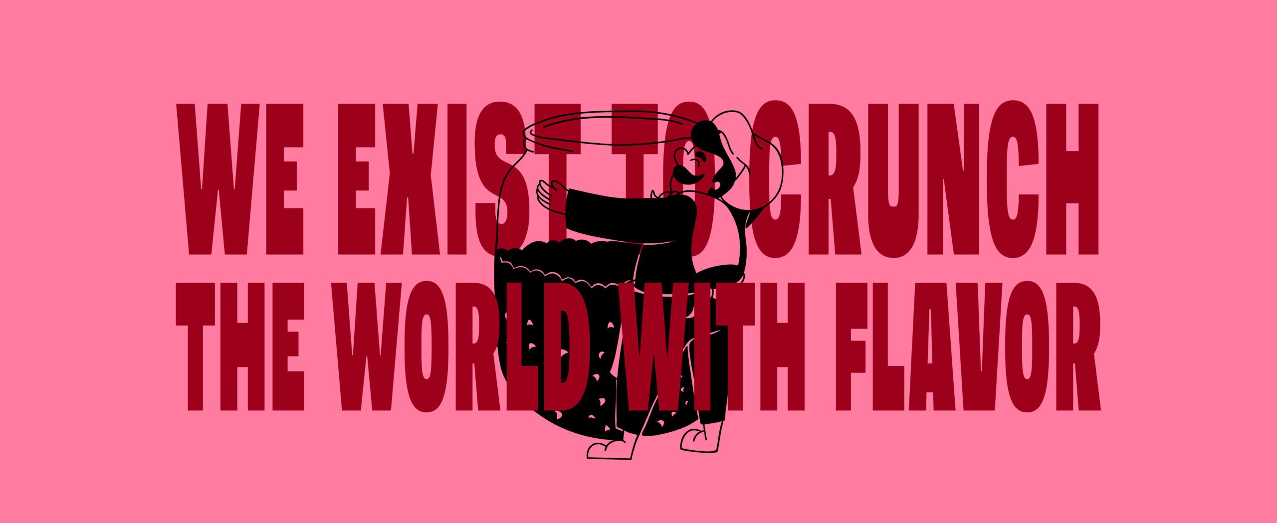
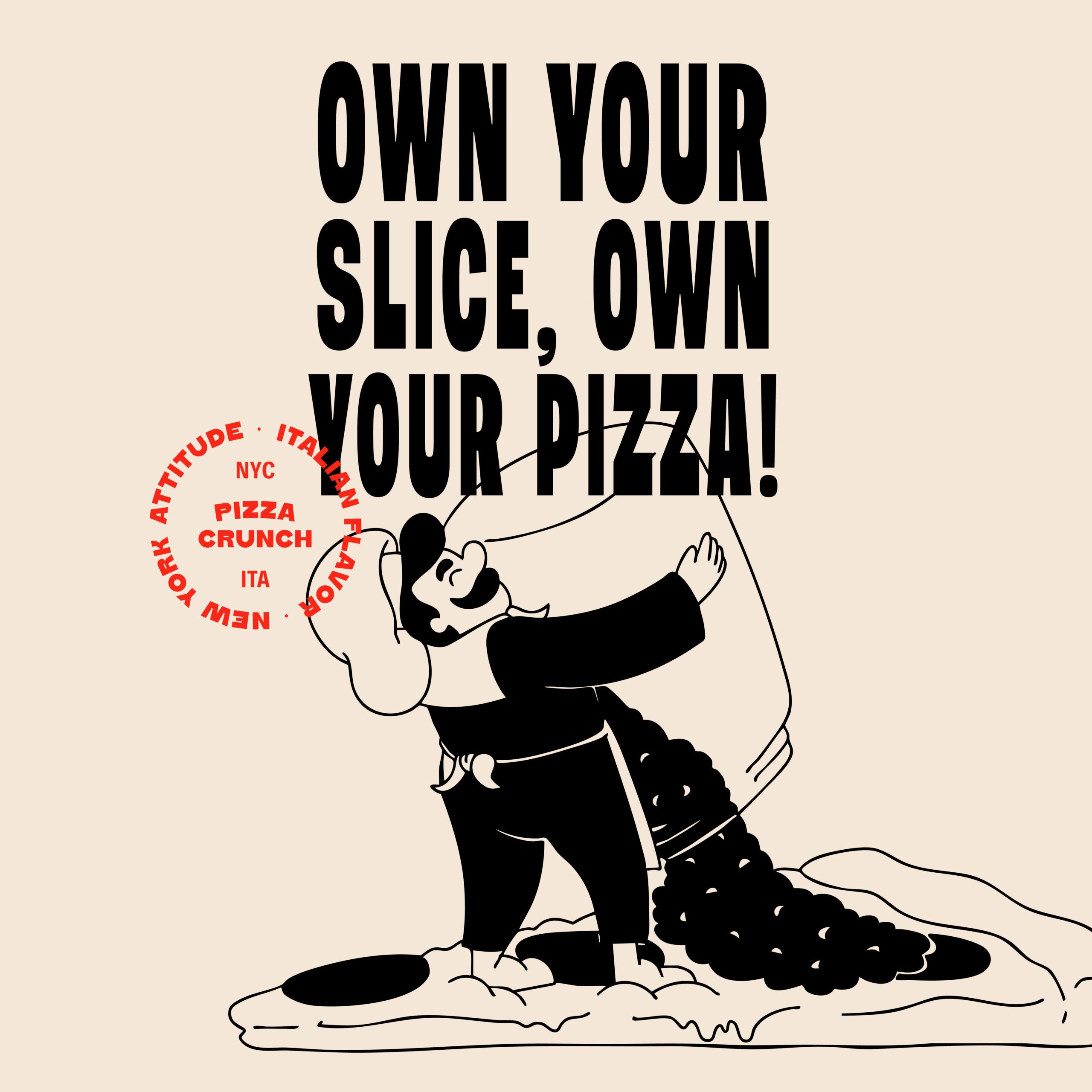
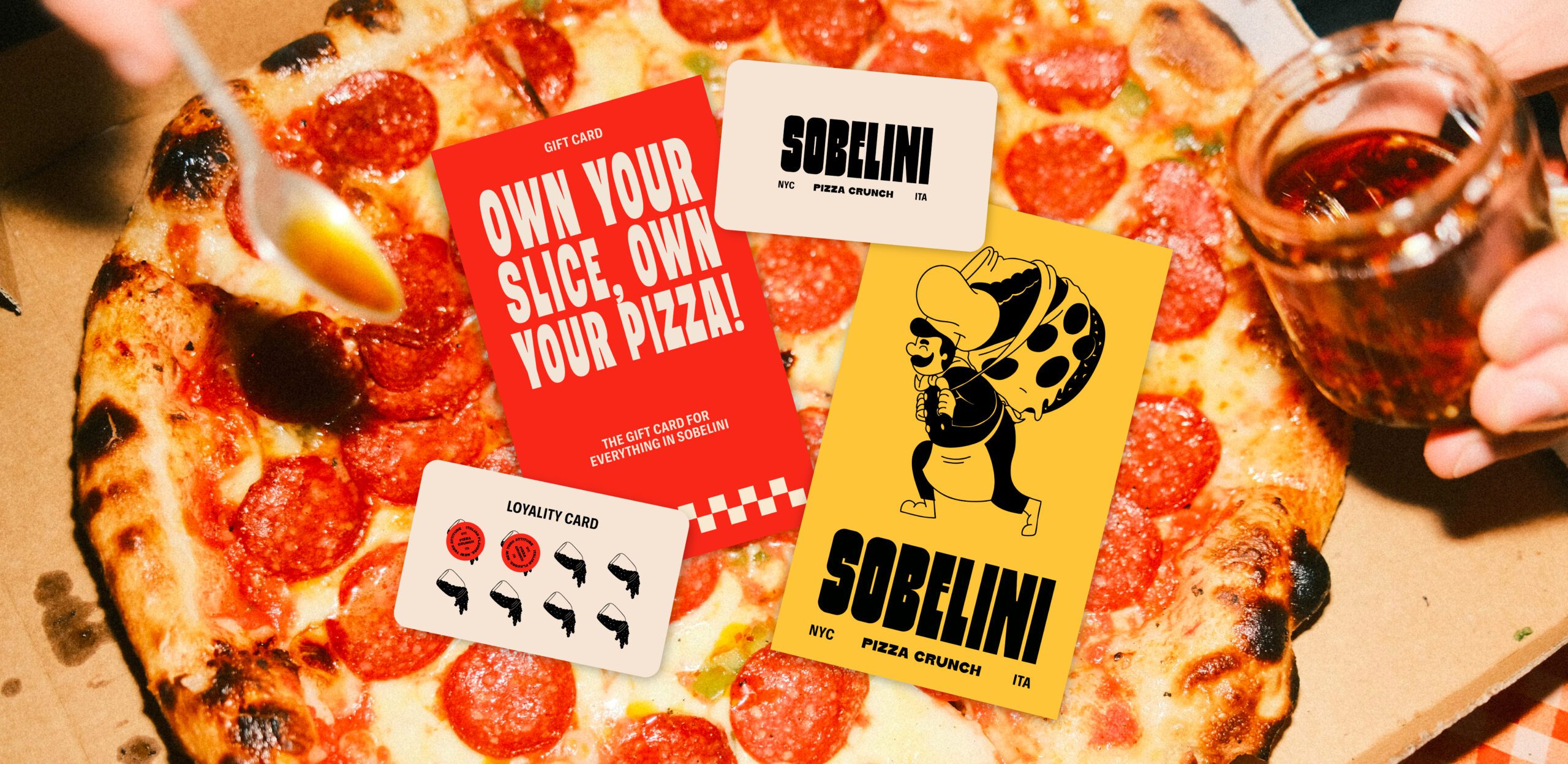
We built the foundation with a tall, condensed typeface, sharp and confident, like a street sign. It anchors the brand with attitude, while inviting bold typographic play that reflects the eclectic, stacked visuals of New York’s food scene. Movement is central to the system. Inspired by the vibrant chaos of NYC life, big signs, crowded crosswalks, and voices from every direction, we built a graphic language full of rhythm and dynamism. At the heart of it all is a charismatic chef character: always in motion, always stirring, tossing, or tasting. He’s the embodiment of Sobelini itself: expressive, playful, and totally in love with the craft. To ground the brand in its culinary roots, we introduced geometric patterns inspired by traditional Italian design. These elements add structure and warmth, nodding to the culture while keeping the overall system feeling modern, fresh, and full of contrast. The result is a brand that’s not only flavorful, but it feels alive. It captures the attitude of NYC and the soul of Italian flavors.

wanna see more?

You may like