


Scope of work:
Location:
Year:
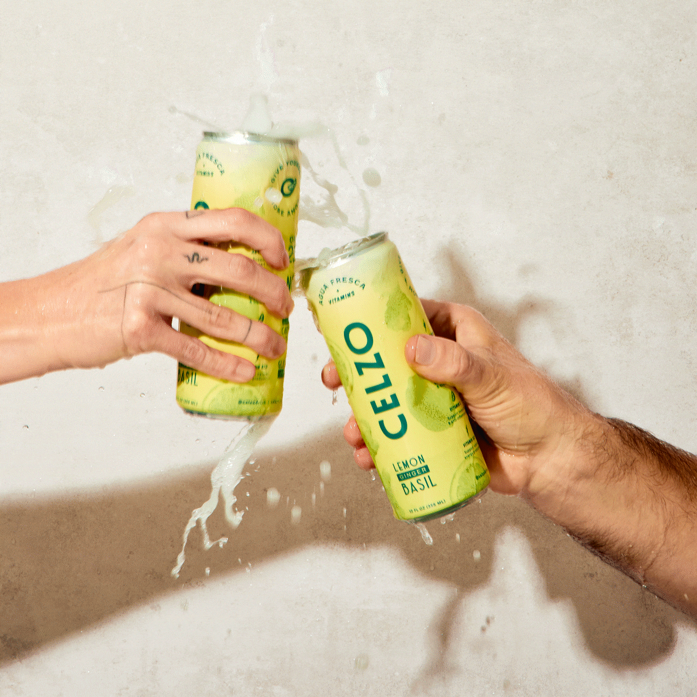
Recognizing that its identity lacked personality and didn’t reflect its rich Mexican roots, Celzo approached us for a brand refresh. Guided by this vision, we developed a bold, authentic, and youthful brand.
The new identity draws inspiration from the vibrant typography used in the streets of La Colonia Condesa in Mexico City and the hand-painted letters known as rótulos in Latin American culture, commonly seen on food stands. By embracing these rich traditions, Celzo’s logo achieves a remarkable elevation that pays homage to its roots.
The isotype takes the form of the letter "O," complemented with a star-like asterisk reminiscent of Mexican rótulos. This composition conveys the image of a refreshing glass of agua fresca, viewed from above, complete with a delightful garnish.
Like the iconic busy streets, Celzo blends various typographies: a cool, personality-filled font, a classical typeface for sophistication, and a lively, Latin street-inspired style. These fonts, paired with a simple one for body copy, create dynamic and versatile compositions.
Celzo’s visual system embodies a vibrant, authentic energy inspired by the complexity of its flavors and the dynamic spirit of Mexico City’s streets. Through a blend of colors, textures, and visual compositions, the brand evokes a raw, urban aesthetic that reflects its essence—capturing the layering of experiences, stories, and traditions in a distinctive graphic language.